| Chart analysis |
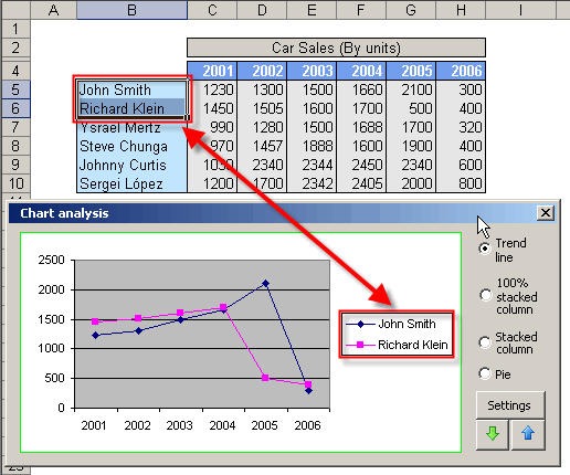
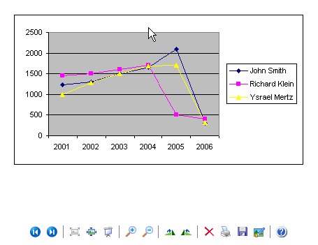
This tool allows us to make graphical comparisons In a twinkle, about data series, using charts.
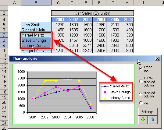
There are 4 kinds of charts:
Trend line, 100% stacked column, Stacked column y Pie.
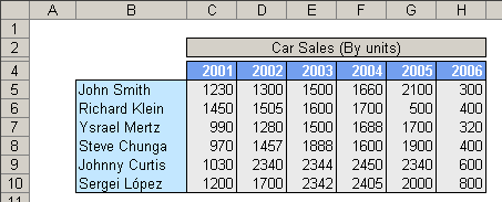
The functionality of this toolbox will be explained through an example in the following table.
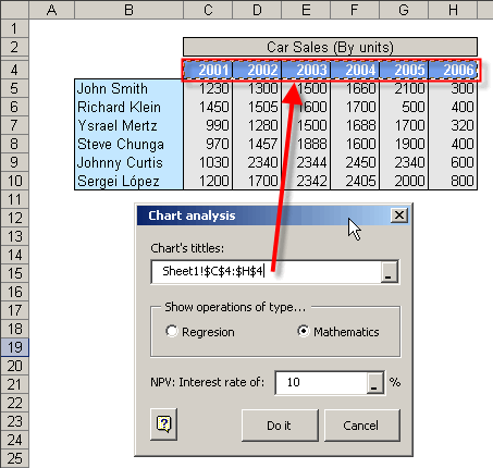
We will enter the information titles that we will use to generate the chart, in this dialog box . Like this:
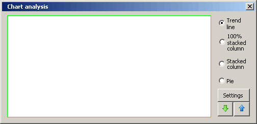
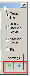
These arrows allow us to enlarge/reduce the dialog box size.
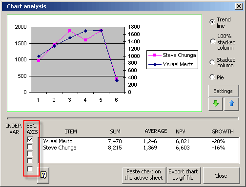
Enlarging the dialog box, you can see in detail, lot of mathematical operations, like this:

This operations can be of 2 types:
1.- Of Regresion (R2), Slope and Intercept
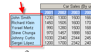
If we choose regresion operations, we must mention which of the selected cells, corresponds to the independent variable.
2.- Common mathematics operations: SUM, AVERAGE, NPV and GROWTH
For the NPV option, we must indicate the interest rate.
Adicionally, the charts can be graphicated with secondary axis. For that, just activate the check.
Interesting, isn´t it?
You also have the option to put the charts over the active page, and export the chart as an image with gif format, for example.
This box is resize-able. Simply place the cursor on the dialog box's borders and reduce/increment its size, according to your convenience.
For a better visualization of the chart, we advise you to set zoom to 100%